
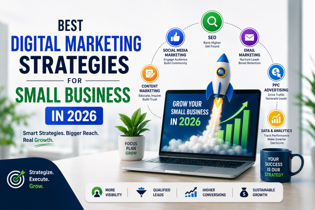
10 NEW Digital Marketing Strategies that helps grow business
This blog explains 10 powerful digital marketing strategies to grow small businesses using SEO, social media, content, and paid advertising techniques.
This blog explains 10 powerful digital marketing strategies to grow small businesses using SEO, social media, content, and paid advertising techniques.
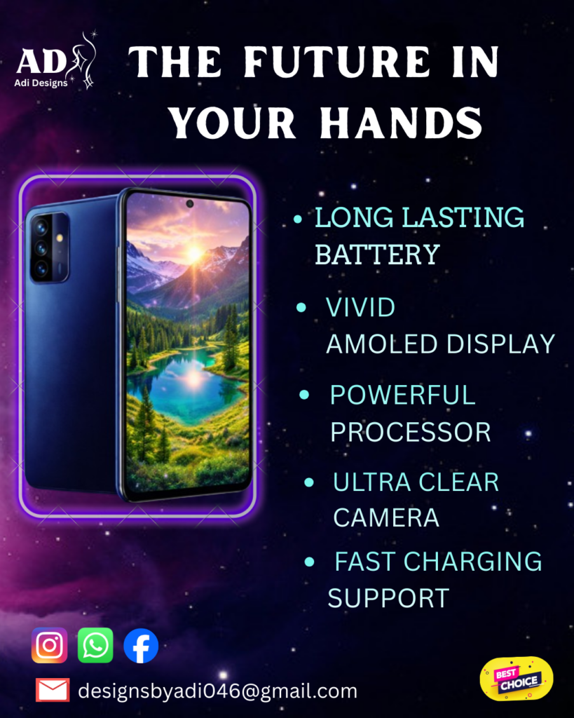
Designing a Mobile UI: Where Simplicity Meets Precision Mobile UI design isn’t about filling screens — it’s about making decisions. Every element you place on a mobile interface competes for attention in a space that’s already limited. The real challenge isn’t designing more — it’s designing less, but better. Why Mobile UI Design Demands Discipline Unlike desktop, mobile users don’t explore — they act. They: That means your design has only a few seconds to communicate clearly. If your interface feels confusing or crowded, the user is gone before you even get a second chance. Step 1: Design With Purpose, Not Decoration Before choosing colors or fonts, ask: Good mobile UI is not about adding features — it’s about eliminating distractions. Step 2: Master Visual Hierarchy On mobile, hierarchy is everything. You guide the user using: The most important element should dominate the screen. Secondary elements should support — not compete. If everything looks important, nothing is. Step 3: Optimize for Thumb Interaction Mobile is a one-hand experience. That means: If users have to adjust their grip to use your app — your design is already failing. Step 4: Keep It Minimal, But Not Empty Minimal design doesn’t mean removing everything. It means: A clean UI improves both usability and perception. It feels faster, smoother, and more premium. Step 5: Consistency Builds Trust Users shouldn’t have to “learn” your interface again on every screen. Maintain consistency in: Consistency reduces cognitive load — and makes your design feel professional. My Design Approach for This Mobile UI While creating this design, I focused on: The goal was simple:Create an interface that feels effortless to use and visually refined. Final Thoughts Mobile UI design is not about creativity alone — it’s about control. The best designs are not the ones that impress at first glance,but the ones that feel natural every time they’re used. As a designer, your job isn’t just to make things look good —it’s to make them work seamlessly. 🔥 CTA (add this at the end) Looking for a clean and modern mobile UI design?Let’s work together — Contact Me
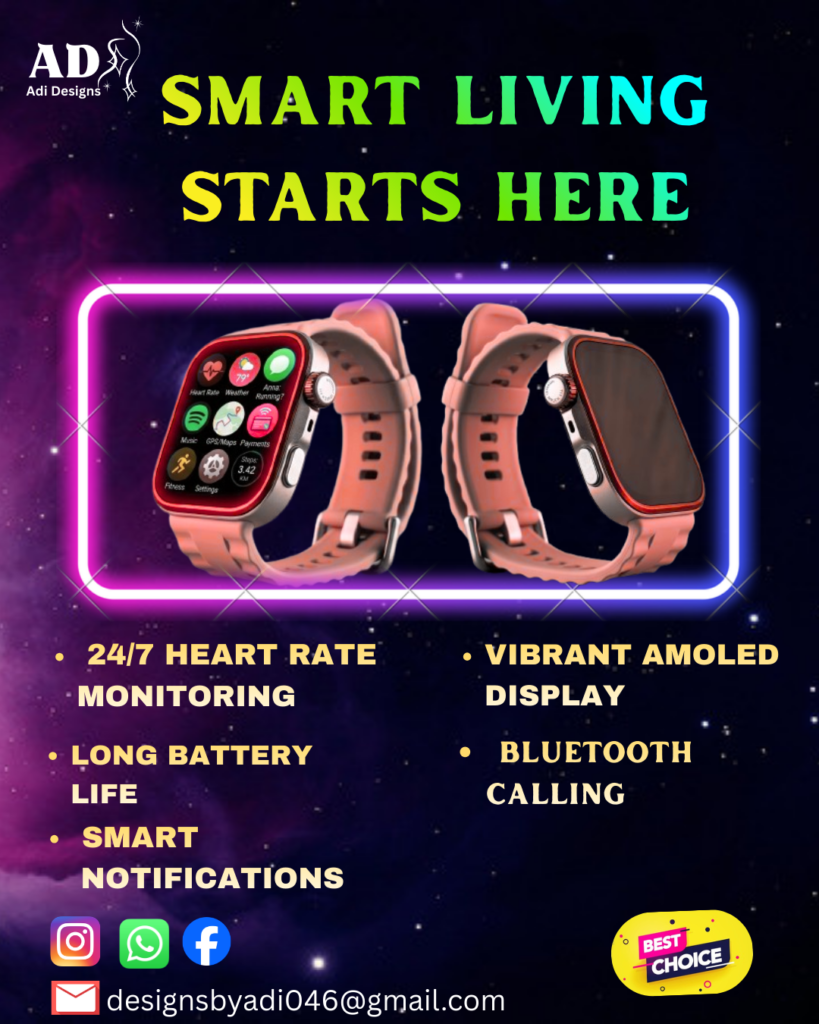
Designing a Smart Watch UI Smartwatch UI design is not just about making things look good — it’s about making them work in one of the most constrained digital spaces possible. Unlike mobile or web design, a smartwatch screen forces designers to think differently. With limited space, constant motion, and quick interactions, every pixel has a purpose. This is where real design skills are tested. Why Smartwatch UI Design is Different Designing for a smartwatch isn’t a smaller version of mobile design — it’s a completely different mindset. Users don’t “browse” on a smartwatch.They glance, tap, and move on. That means your design must be: If your UI needs thinking, you’ve already lost the user. Step 1: Start With Function, Not Style Most designers make this mistake — they jump into colors and visuals first. Wrong approach. Start by asking: A smartwatch UI should never feel crowded.If you can remove something and it still works — remove it. Step 2: Design for Glanceability Smartwatch users don’t read — they scan. So your design should follow: For example:Instead of writing “Heart Rate: 98 BPM”Just show: 98 ❤️ That’s faster. That’s better. Step 3: Use Strong Visual Hierarchy On such a small screen, hierarchy is everything. You need to clearly define: Use: If everything looks important, nothing is important. Step 4: Keep Interactions Effortless Smartwatch interactions should feel natural and fast. Best practices: Avoid: The goal is speed, not features. Step 5: Minimalism Wins Every Time This is one place where minimal design is not a trend — it’s a requirement. Use: Every extra element increases confusion. A clean UI doesn’t just look better — it performs better. My Design Approach for This Smartwatch UI While creating this design, I focused on: The goal was simple:Make the UI feel fast, clear, and premium. Final Thoughts Smartwatch UI design teaches one powerful lesson: Good design is not about adding more — it’s about removing what’s unnecessary. When space is limited, your decisions become sharper.And that’s what separates average designers from great ones. If you’re a designer, challenge yourself:Try designing something with half the space and twice the clarity. That’s where real growth happens.
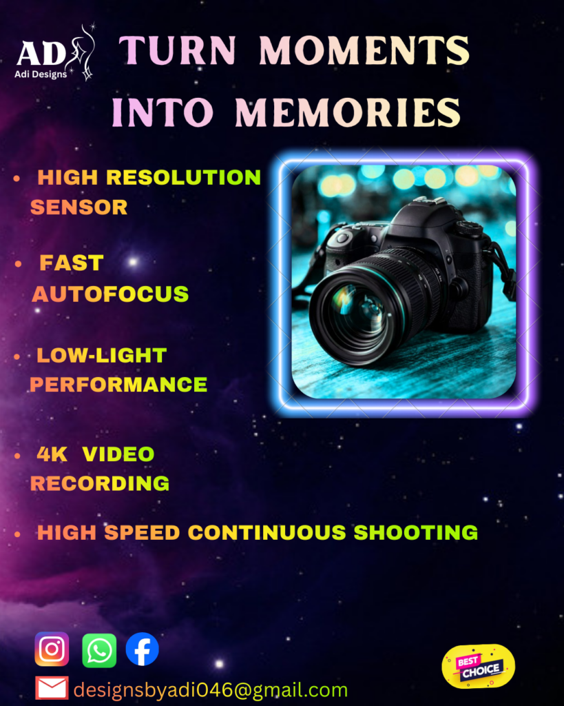
How I Designed a Premium DSLR Camera Poster That Commands Attention In a world where visuals compete for attention every second, creating a poster that stands out is not just about aesthetics—it’s about control, clarity, and intention. This DSLR camera poster design was built with a clear focus: to present the product as powerful, premium, and impossible to ignore. Understanding the Objective Before opening any design tool, I defined the core purpose of this poster. The goal was not simply to “make it look good,” but to communicate value instantly. The design needed to: Without this clarity, even a visually appealing design can fail to deliver results. Concept: Let the Product Speak The concept behind this design revolves around minimal distraction and maximum impact. Instead of overcrowding the layout, I chose a focused composition where the DSLR camera becomes the hero. A dark, atmospheric background was used to create depth and contrast. This approach ensures that the product naturally stands out, while also giving the design a cinematic and modern feel. To elevate the visual appeal, I incorporated subtle neon lighting effects. These elements add energy to the composition without overpowering the main subject. Design Execution Every element in this poster was placed with intention. 1. Background & MoodA dark gradient background was selected to create a premium and dramatic tone. This not only enhances visibility but also aligns with the high-end positioning of the product. 2. Product PlacementThe DSLR camera was positioned centrally to establish immediate focus. This eliminates confusion and guides the viewer’s attention exactly where it should be. 3. Lighting & EffectsCarefully placed highlights and glow effects were used to simulate studio lighting. This adds depth and realism, making the product feel tangible and refined. 4. TypographyClean and modern typography was chosen to complement the overall aesthetic. The goal was clarity—no unnecessary complexity, just strong and readable communication. Tools & Techniques This design was created using Adobe Photoshop, focusing on: The key was not the tools themselves, but how they were used to support the concept. Final Outcome The final poster delivers a strong visual impact while maintaining simplicity. The DSLR camera stands out as the centerpiece, supported by lighting, contrast, and composition. It successfully communicates a premium feel without relying on clutter or excessive elements—proving that restraint is often more powerful than overdesign. Closing Thoughts Good design is not about adding more—it’s about removing what doesn’t matter. This DSLR poster is a reflection of that mindset. Every choice, from color to composition, was made with purpose. And that’s what separates a design that looks good from one that actually works.
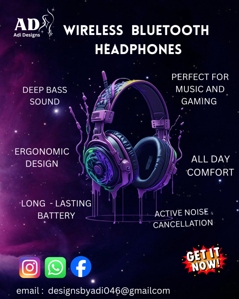
How I Designed a High-Impact Headphones Poster 🎯 The Goal This wasn’t just about making something “look good.” The objective was clear: Because in real-world design, if your visual doesn’t work in 3 seconds, it fails. 💡 The Idea Behind the Design Instead of overcomplicating things, I focused on one core principle: Let the product do the talking. Most beginners make this mistake:They add too many elements, effects, and colors — and the product gets lost. I did the opposite. The goal was to create a design where the viewer’s eyes go:Product → Offer → Brand 🎨 Step 1: Concept & Inspiration Before opening any software, I defined: I explored references, but didn’t copy anything. 👉 The focus was:“How can I make this look expensive?” 🎯 Step 2: Color Selection I chose a blue gradient background for a reason: Instead of using too many colors, I kept it controlled: 👉 Less colors = more clarity. 🔤 Step 3: Typography Typography wasn’t random. I used: Why? Because fancy fonts kill readability. The goal was: 👉 If people struggle to read, they scroll past. 🧩 Step 4: Layout & Composition This is where most designs fail. I followed a simple structure: Everything was aligned to guide the viewer naturally. I avoided clutter and unnecessary elements. 👉 Good design is not about adding more —it’s about removing what doesn’t matter. ✨ Step 5: Making the Product Stand Out To make the headphones pop, I used: No heavy effects. No distractions. 👉 The product should feel like the hero — not just another element. ⚡ Step 6: Final Touches At this stage, I refined: I zoomed out and asked: “Does this look premium or average?” If it looked average, I adjusted it. Because small details separate: 📌 Final Outcome The final design achieved: Most importantly:👉 The product stands out without confusion. 🧠 What Most Designers Get Wrong Let’s be real. A lot of designers: And then wonder why their work looks “off.” Good design is not about showing skills. It’s about solving a visual problem clearly. 🚀 Key Takeaways If you’re designing product posters, remember: 💬 Final Thought Anyone can place elements on a canvas. But real design is about: Controlling what people see, and in what order. That’s what turns a normal graphic into a high-impact visual.
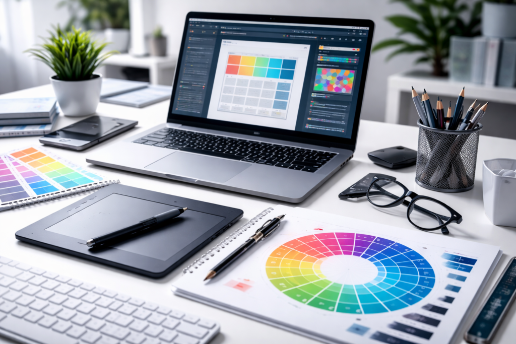
HOW I MAKE GRAPHIC DESIGNS Graphic design is not just about making things look attractive. When I work on any graphic design project, my goal is simple—create designs that solve problems and deliver results. Most beginners focus only on visuals. That’s why their graphic design looks good but doesn’t perform. My approach is different. Every design decision I make has a clear purpose. Starting With Understanding the Goal Before I begin any graphic design project, I focus on one thing—understanding the goal. Is the design meant to: Without this clarity, even a visually appealing graphic design can fail. This step helps me avoid random decisions and keeps the design focused. Research and Inspiration Good graphic design doesn’t start from a blank mind. I study: This helps me understand what works and what doesn’t. But I don’t copy. I analyze and improve. Creating a Clean and Effective Layout Layout is the foundation of strong graphic design. I always focus on: Cluttered designs confuse people. Clean layouts make the message easy to understand. Simple designs often perform better than complex ones. Choosing Colors With Purpose Color is a powerful tool in graphic design. Instead of choosing random colors, I focus on: For example: Right colors make the design feel intentional and professional. Typography That Enhances the Design Typography is not just about style—it’s about communication. In my graphic design process, I: Too many fonts or poor choices can make a design look unprofessional. Building Visual Hierarchy One of the most important parts of graphic design is guiding the viewer. When someone sees the design, they should know: If everything looks the same, nothing stands out. Hierarchy brings clarity and direction. Refining and Improving the Design I never stop at the first version. In every graphic design project, I refine: Small changes can take a design from average to professional. Avoiding Common Graphic Design Mistakes Many designs fail because of simple mistakes. I make sure to avoid: Fixing these alone can improve most graphic design work. Why My Graphic Design Approach Works This process works because it focuses on clarity and purpose. Good graphic design: Bad design does the opposite, no matter how “creative” it looks. Final Thoughts on Graphic Design Graphic design is not about adding more elements. It’s about making the right decisions. When you focus on purpose, clarity, and simplicity, your designs naturally stand out. That’s the approach I follow in every project. And that’s what turns ordinary visuals into effective graphic design.